Todays Project is to create a business card for Old Europe. Since I am not a graphic designer.. this is all very much trial and error. That being said, I would like an opinion from you all. So, please drop a comment and vote for which card you like the best. Any opinions are also welcome.
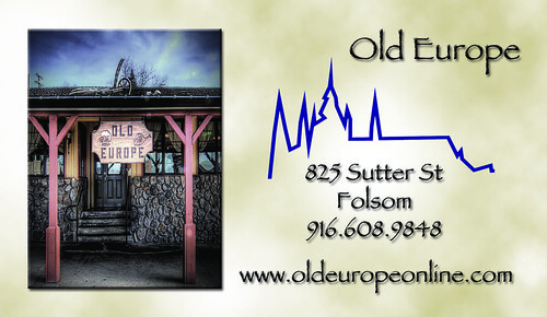
I'm kinda diggin #3. As far as a suggestion, how about #2 without the line thingy (looks like a depressing day on wall street....hey, you asked), and making the image larger and then fading into the green as a background for the text......
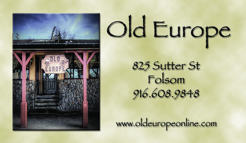
Hey there. I'm also digging card #3. You have good use of contrast with the bold and large font. I'd make one suggestion with it, and that would be to group all the contact information (address, URL, phone number) at the bottom and maybe left align it. The white space in the middle will help draw eyes to the picture, and from there lead to the contact information. Just your daily advice from a complete stranger. ;)

8 comments:
Steve,
I'm kinda diggin #3. As far as a suggestion, how about #2 without the line thingy (looks like a depressing day on wall street....hey, you asked), and making the image larger and then fading into the green as a background for the text......
Mike, clear as mud....
Alrighty then :)
Hey there. I'm also digging card #3. You have good use of contrast with the bold and large font. I'd make one suggestion with it, and that would be to group all the contact information (address, URL, phone number) at the bottom and maybe left align it. The white space in the middle will help draw eyes to the picture, and from there lead to the contact information. Just your daily advice from a complete stranger. ;)
#3. From the anonymous poster that used to work for you in Seattle....
Hey there Anonymous... I would use the word "Word" loosely in that context.
We drank a lot though
Yup! Go with #3 Steve! Simple & Elegant.
Good Day Sir! :)
This is elegant card...it can be used for as a template for the design of plastic business cards..what do you think of it.
Your designs impresses me a lot completely representing the tittle and i think it`s good practice to draw old cities on card...
شركة رش مبيدات بالدمام
شركة تنظيف كنب بالدمام
شركة زهرة الخليج
تسليك مجارى
تنظيف منازل
كشف تسربات
مكافحة حشرات و رش مبيدات
نقل عفش و اثاث
Post a Comment